
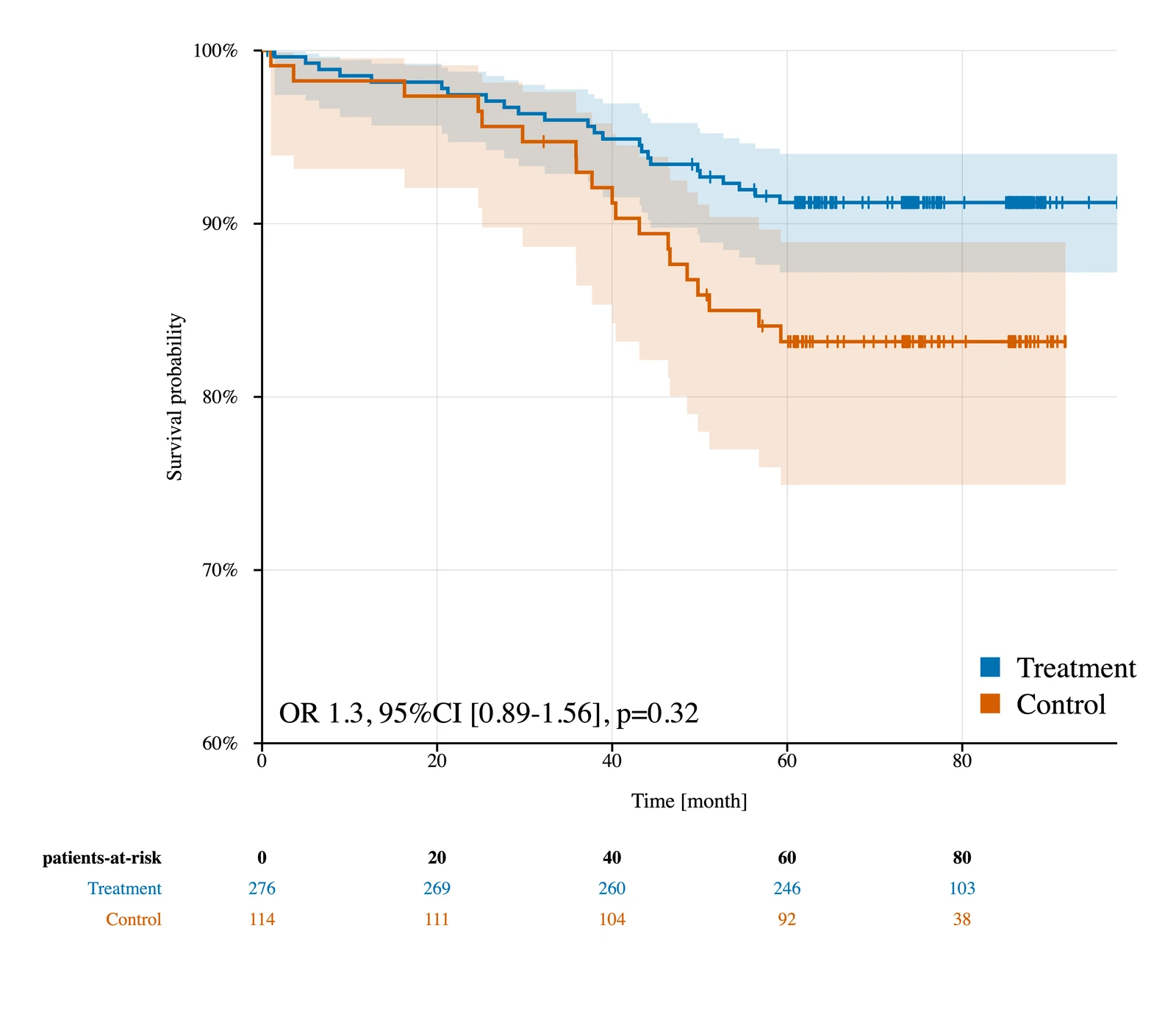
Kaplan–Meier Survival
Product-limit estimates with censor marks, Greenwood variance, log–log confidence intervals and adjustable patients-at-risk tables.
Create clean statistical figures from manual, CSV or spreadsheet data — without coding, complex online workflows or recurring subscription fees.
One-time purchase · No monthly subscription
Clinical visualizations
Purpose-built tools for figure types used in manuscripts, theses, conference posters, presentations and clinical research reports.
Product-limit estimates with censor marks, Greenwood variance, log–log confidence intervals and adjustable patients-at-risk tables.
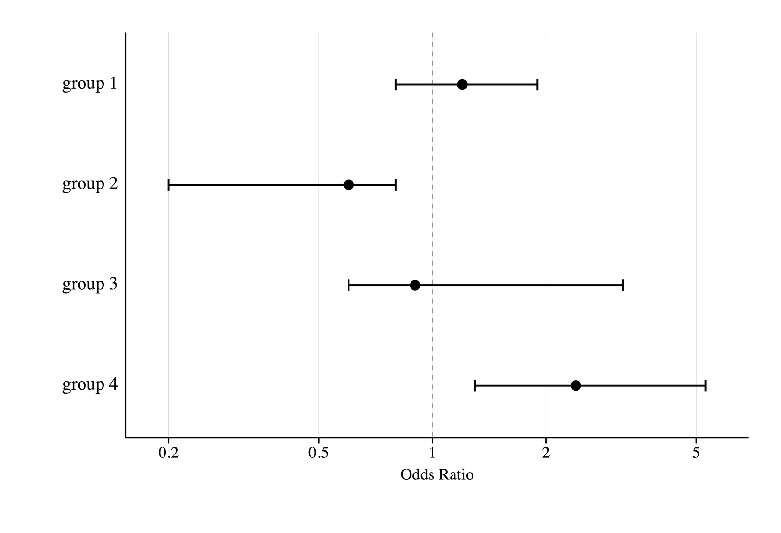
Display precomputed ratio or difference effects with linear or logarithmic scales, interval caps and reference lines.
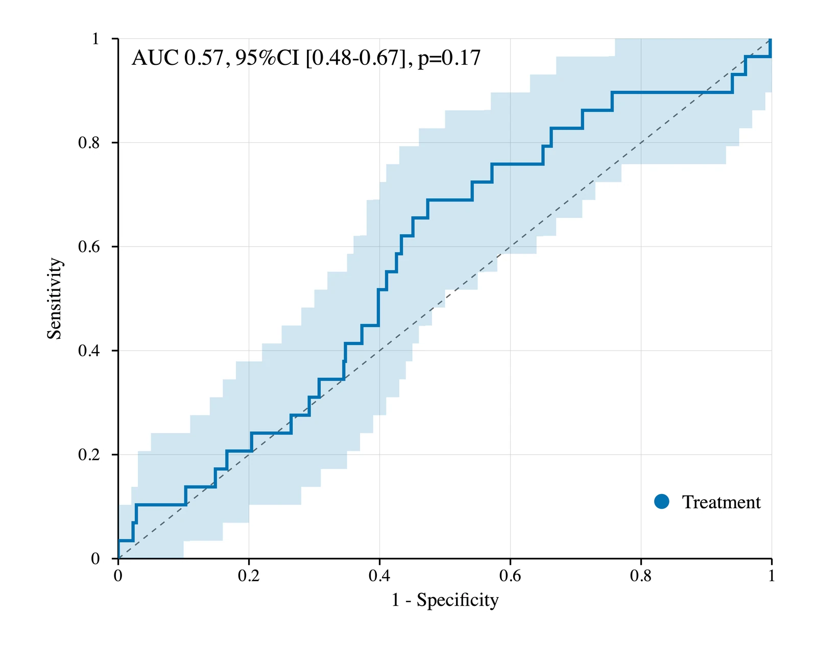
Compare multiple numeric markers with AUC estimates, cutoff statistics, paired DeLong comparisons and optional bootstrap bands.
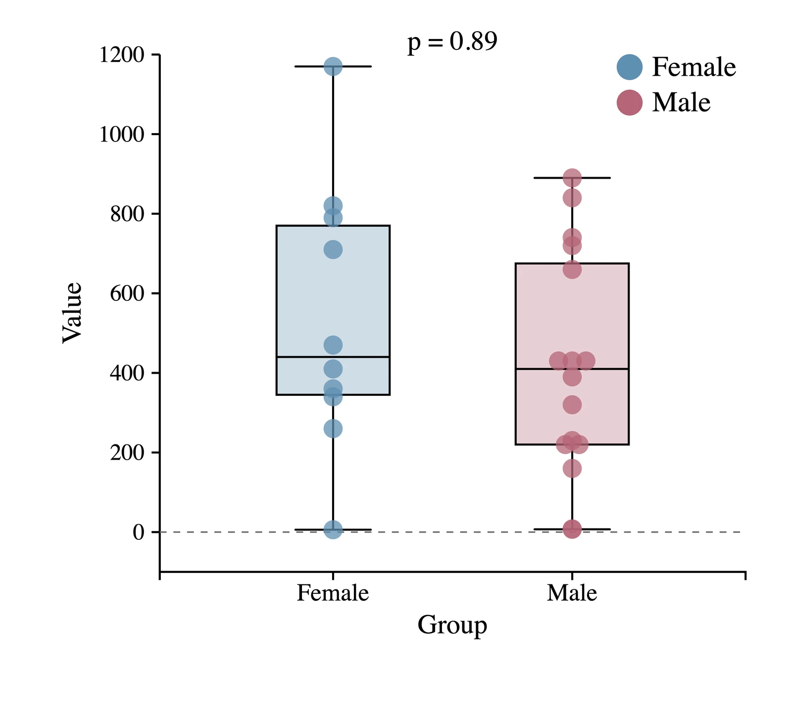
Combine distributions, individual observations and summary values while retaining precise control over presentation.
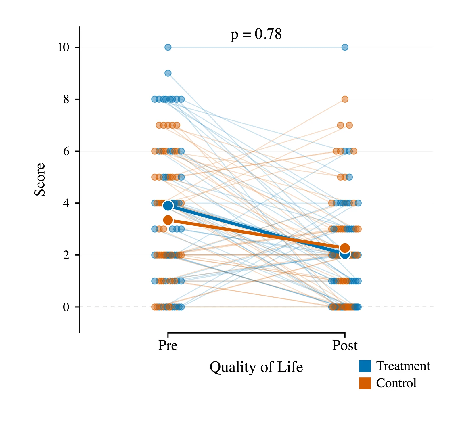
Show before-and-after or matched measurements with individual trajectories, custom labels and summary tables.
Research workflow
A clean data–plot–adjustment workflow keeps the source values, live figure and presentation controls close together.
Enter values manually, paste them into built-in tables, or import CSV and spreadsheet files.
Create grouped or stacked bars and linear, logarithmic or exponential regression plots alongside the core clinical visualizations.
Adjust axes, labels, legends, colors, symbols, fonts, annotations, dimensions and tool-specific presets.
Save PNG, JPEG, TIFF or BMP figures at 300, 600 or 1200 DPI for manuscripts, posters and presentations.
Scientific transparency
The methodology documents data handling, estimators, assumptions and implementation choices — including Greenwood and log–log intervals for Kaplan–Meier analysis, paired DeLong comparisons for ROC/AUC and the scope of descriptive plotting tools.
Phi 2.1.1 was independently compared with R across descriptive, survival, ROC/AUC and curve-fitting workflows. All 15,702 numerical comparisons and all 10 input and rule checks passed the prespecified criteria.
Read the complete Phi methodology →One purchase for your offline macOS or Windows workflow.
One-time purchase · No monthly subscription